PROJECT STATEMENT
The project for the Griffin Gals softball team involves the creation of a comprehensive visual identity that reflects the team's spirit, heritage, and values. Founded by four Puerto Rican sisters, the team embodies the essence of family, unity, and pride, both on and off the field. The main logo features a Gryphon inside a crest, holding the Puerto Rican flag within a softball, symbolizing the team's deep connection to their heritage and strong bond as sisters. The sub-logo, a representation of the Puerto Rican flag with Gryphon wings coming out of both sides, is accompanied by the letters "GG" above it for 'Griffin Gals,' highlighting their family name and the unity they share.
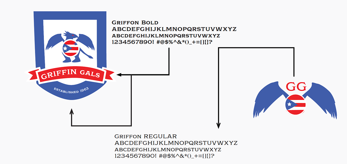
The color pallete of blue, white, and red draws inspiration from the Puerto Rican flag, where blue signifies the sky and coastal waters, white represents peace and freedom, and red symbolizes the blood shed by warriors, reflecting the team's cultural pride and heritage. The choice of the Griffon Bold typeface for the main logo adds a bold and strong look, symbolizing the team's competitive spirit and determination on the field. In contrast, the use of Griffon Regular for the sub-logo conveys a more traditional and elegant style, reflecting the team's values of unity and pride.
These logos are also used in various documents such as business cards, newsletters, envelopes, and home and away jerseys and hats. The numbers 13, 33, 23, and 15 on the business card and newsletter symbolize each sister's number, emphasizing their unity and individuality. Including the last name "Sanchez" on the away jersey is a tribute to their mother's maiden name, adding a personal touch to the design and reinforcing their family bond.
Each element of the visual identity is carefully crafted to represent the team's values and heritage. The dimensions for the project, including the 8.5” x 11” letterhead, 3.5” x 2” or 2” x 3.5” business card, 9.5” x 4.125” #10 envelope, and 5" x 5' logos ensure that each piece of the identity system is professionally presented and consistent with the team's visual identity. The project aims to create a cohesive and impactful brand that not only reflects the team's identity but also resonates with its fans and supporters.
SKETCHES
The sketches I created depicted various ideas and design variations, with the final logos closely resembling these initial concepts, with the addition of text and some minor adjustments.

NEWSLETTER (ROUGHT DRAFT)

BUSINESS CARD (ROUGHT DRAFT)


ENVELOPE (ROUGHT DRAFT)

LOGOS (ROUGHT DRAFT)


My first logo was very complex and detailed.
NEWSLETTER (FINAL DRAFT)

ENVELOPE (FINAL DRAFT)

BUSINESS CARD (FINAL DRAFT)


LOGOS (FINAL DRAFT)


For my second set of logos, I aimed for simplicity to ensure they could be easily enlarged or shrunk.
UNIFORMS


Away Uniform Home Uniform
COLOR STUDY

TEXT STUDY